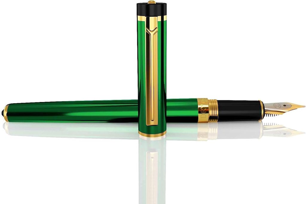
The Dryden Designs line of fountain pens is a basic pen, with a good feel and a smooth stainless nib. They are decent daily driver pens. I bought this one and a bottle of their Unforgiving Black ink for about $45 in September of 2020 and it has served well for journal writing since.
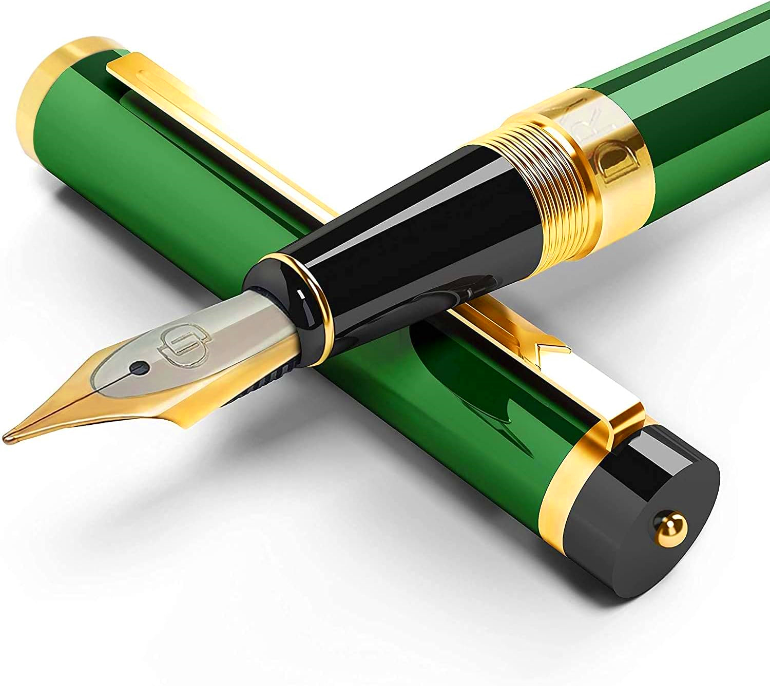
My attraction was to both the design and the color of this pen. The emerald barrel is lovely, and the gold trim and glossy black parts set it all of well. The stiff medium nib is finer than most others I have and feels smooth at my favorite writing angle.

I did have one issue with the pen shortly after I received it. The cap developed a wobble, as if it wasn’t on tight, but no amount of pressing seemed to help. Finally I discovered that it has an inner cap that screw in the the metal outer cap. Once I found a way to tighten that (I used a dowel), all has been right with the pen. Happily ever after.

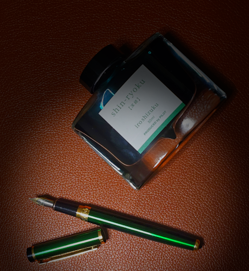
Recently I decided to pair the pen with green ink, more for whimsy’s sake than any real need. I saw that Wordsworth & Bläck have a “racing green” and imagined that I could be writing in my favorite color of Jaguar. Alas, it turned out to by Kawasaki racing green rather than the rich BRG I had imagined.
So I tried to buy Pilot Emerald, but found it is long discontinued. So I went with this “shin-ryoku“, their forest green, which turned out to match the pen color very well.
I don’t want to get in the rut of having ink color match the barrel all the time, but when the pen color is so bold, the pen seems to ask so a special dispensation.
Do you match ink to pen in some way? Or do you prioritize your favorite ink over the personality for the delivery system?

